The Art of Choosing Color for Print
When it comes to marketing you’re careful to choose amazing images with lots of color for your website and social media posts, so why wouldn’t you do the same in your print pieces? You can’t beat a great custom marketing piece to make a statement about your business! Did you know readers are 9 times more likely to remember what they see in color, versus something printed in just black? They are also 70% more likely to remember the details of what they’ve read if printed in color! There is no denying that using color effectively for your print advertising isn’t worth the lower cost associated with black and white printing. No wonder 50% of company forms and documents are done in full color, from postcards to flyers!
So…now that you have decided to only print in color, we want to ensure you select the right colors to catch customers’ attention. Let’s take a look at the color list below and the emotions each one triggers:
RED:
Red is the warmest and most dynamic of the colors- it triggers opposite emotions. It is often associated with passion and love as well as anger and danger. Red can increase a person’s heart rate and make them excited. If you want to draw attention to a design element, use red. But use it as an accent color in moderation as it can be overwhelming.
BLUE:
Blue evokes feelings of calmness and spirituality as well as security and trust. Seeing the color blue causes the body to create chemicals that are calming. It is no surprise that it’s the most favored of the colors. Dark blues are great for corporate designs because it helps give a professional feel, but using too much can create a cold, disengaging feel. Light blue gives a more relaxing, friendly feel. Great examples are social sites like Facebook and Twitter who uses lighter blues.
ORANGE:
Orange enhances a feeling of vitality and happiness! Like red, it draws attention and shows movement but is not as overpowering. It is aggressive but balanced- it portrays energy yet can be inviting and friendly. Orange is great for a call to action to buy or subscribe to a product.
YELLOW:
Yellow is perhaps the most energetic of the warm colors. It is associated with laughter, hope and sunshine. Accents of yellow give your design energy and will make the viewer feel optimistic and cheerful. However, yellow tends to reflect more light and can irritate a person’s eyes. Too much yellow can be overwhelming and should be used sparingly. In design, it is often used to grab attention in an energetic and comforting way.
GREEN:
Green symbolizes health, new beginnings and wealth. Green is the easiest on the eyes and should be used to relax and create balance in a design. It is a great color to use if the company wants to depict growth, security or inspire possibility.
PURPLE:
Purple is associated with creativity, royalty, and wealth. Purple is often used to soothe or calm a viewer, hence why it is used in beauty products. Incorporate purple to make a design look more luxurious and wealthy, or a lighter purple to show romance and mystery.
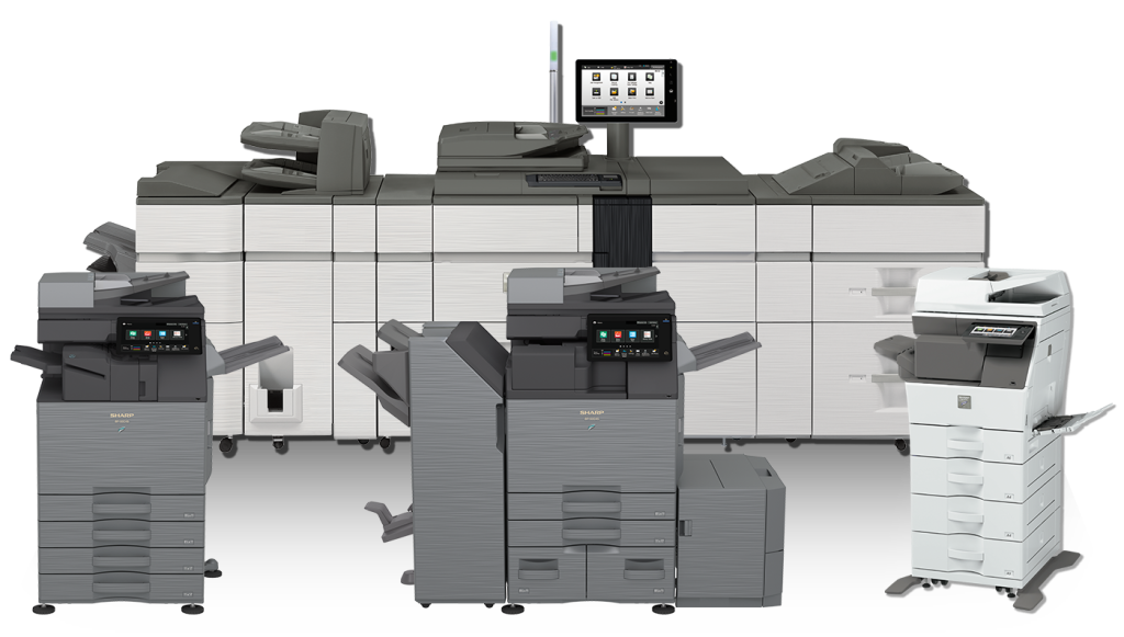
Color will definitely make a positive impact that will stand out from the crowd! All of our Color Copiers and MFP’s here at A1 Image have the ability to print full color marketing material that your business needs to grab your customers’ attention!! Get started today…

